In what ways does your media product use, develop or challenge forms and conventions of real media products?
My product uses the conventions of real media products in various ways. Eye catching titles are a conventional and iconic aspect of magazines that I have transferred into the product; this feature has been tried and tested in the form of a devised test involving whether the magazine stands out from a set distance (i.e. 1 metre to 2 metres) by myself and a few select of the target audience. Conventions are developed in the use of typographic styles and image styles to convey and reflect the genre of magazine as well and the target audience. The title’s font style that is used reflects on the urban culture, and acts as an ‘iconic’ font that will reflect on the magazine and make it a well-known ‘brand’. Here are a few examples of existing ‘typographic’ font styles on real media products (magazines and other media products) that make them well known brands:
Rolling stone magazine is a world known media product. It target audience is the younger generation i.e. teenagers, and focuses on the pop culture, film actors and television.
The typographic style is a conventional feature that makes the product the 'success' it is. The font allows for the magazine to have it as a 'trademark' allowing for world wide acknowledgement
McDonald's is a world wide known brand. It is famous for it's chain of fast food restaurants. It's iconic golden arch 'M' is what makes it recognizable in over 120 countries. This logo and the typographic 'font' that is used by the company is what makes it a global success that is well known.
Such features as the layout are a conventional aspect of existing music magazines that I have transferred into my product. Such features as the ‘lures’ are conventional aspects that apply for all magazine products; this was an obvious feature to transfer onto my product. But such features as ‘contents page’ layout with ‘band shots’ and ‘mini reviews’ was a feature I developed from existing products like ‘NME’ and ‘Kerrang’.
Here is a video I came across from a market leading businessman 'Mike Harris'. In this video he tackles the question 'What does being iconic mean?'.
How does your media product represent particular social groups?
The target audience for my music magazine are the ‘Indie scene’. The indie scene mainly consists of teenagers who dress in independent labelled clothing, who listen to an ecliptic range of music (indie to classic rock etc.) and who have an acute taste for cultural activities. This age group in a nutshell is from 15 – 25 (roughly the age of a typical teenager and the end age of a student). Representative of this social group are elements such as the use of models, the use of typographic fonts and the use of language. Other elements that may convey the social group are the actual ‘stories/ articles’ in the magazine themselves.
This is an image that represents the social group that are my target audience. As you can see they are all of the age of about 18 - 23. Their fashion sense and mannerisms are typical of the 'indie' social group.
What kind of media institution might distribute your media product and why?
The media instition that i would chose to publish my magazine would be IPC media. The reason for choosing this institution is due to the fact that they publish 'NME' magazine (a magazine that is aimed at my target audience and which has influenced my media product dramatically in terms of conventional features). IPC media are a large WELL KNOWN company as well as the company having their own advertising sector, meaning the advertisement of my magazine would result in it become a possible leader/ well known product in the market.
An institution to distribute my magazine would be 'newsagents'. One of the newsagent leaders is WH smith. This newsagent are well known for distributing magazines as well as providing in-store exclusive 'subscription' services. I feel that one of the market leading companies for distributing my media product would help for it to become a 'well known', national success. In store the magazine will be placed on a rack. The magazine will be surrounded by contending products so 'eye catching' features were considered before the production of the product. The success of display in WH smith is that the product will be placed at 'eye level' height, allowing for instant 'awareness' of the media product. As well as the leading newsagents to distribute my media product I would like 'smaller' chains of newsagents to distribute the magazine.
Another distribution method that I could possibly use is the use of publishing it 'digitally'. This will allow for the magazine to be easily accessed as it follows new media convergence. Such technology as home computers and laptops mean that the magazine could be viewed on screen. 'Tablets' are a rapidly growing popular way to view the web, and host genre specific 'apps'. Such products as the 'Ipad' will be able to host an app designed specifically for viewing my magazine and others. This allows the accessibility of the product to be greater as it can be viewed 'on the way to work' or 'on the way to school' and the digital format of the product will be cheaper to publish compared to 'print' format.
Who would be the audience for your media product?
The target audience for my media product will be teenagers and students. An exact age barrier will be '15 - 25'. Splitting this age group into two section (teenagers and students) there are many reasons for this audience.Teenagers nowadays are social segregated. There are teenagers who are interested in 'rock' music, metal, hip hop, R n B, Drum and bass, Dubstep and Indie rock. Within these 'music' genres social groups are formed in terms of 'lifestyle' and 'opinions', even 'fashion. The genre of magazine will be aimed at the 'indie' genre, this means that elements such as 'indie' music will have to be conveyed throughout the magazine as well as 'fashion icons'. Teenagers of this social divide typically range from the age of '15 to 18'. The second divide are 'students'. Students to me are typically from the ages of '18 to 25' as this is the typical age of students who attend uni. The reason for aiming the magazine at students is mainly because of the different social groups, but also because bands tend to tour a 'uni' circuit so the 'promotion' of the genre of music will allow for the promotion of bands.
In the vlog I wasn't able to include the images mentioned. They are provided below.
In order they stand as - Never mind the Buzzcocks (Noel Fielding in centre), Nick Grimshaw and Ed McFarlene.
How did you attract / address your audience?
Gaze Theory:
For my magazine I have chosen models that represent and reflect the target audience. The main model that is used is a male in his late teens (17 years old). He is seen to be wearing a denim shirt and has a quirky, slick hairstyle reflective of the genre (an undercut). As well as costume props allow for reflection on the genre and target audience, in this case the artist holds a guitar, the way in which it is held seems 'cool' and shows that it is an fashion 'accessory' instead of a 'musical instrument'. These features allow for the play of gaze theory. The female target audience will look at the model and aspire to be with someone who is like the model, whereas the male audience will look at the model and aspire to look like them.
Typographic Font:
The font style that is chosen is consistent throughout the magazine. This is because it follows a house style. The font reflects on the 'urban' culture as the letters appear to be slightly 'battered' and 'rough'. Some letters are even slanted which reflects on the 'subverted' views of the 'independent world'. To me this urban typography is perfect for the magazine and helps to convey and attract the attention of the chosen social group.
Language/ writing style:
Colloquial language is used throughout the magazine. Instead of 'formal' and 'literate' text this to me helps to attract the interest of the target audience. use of Colloquial language means that the target audience can relate as well as understand certain articles. Articles are written in an 'informal' way, this allows for 'cultural' views to be learnt by the target audience, and will attract them.
What have you learnt about technologies from the process of constructing this product?
From the start of the preliminary task I had basic knowledge in using software such as Photoshop, Illustrator and In design to produce a media product. As well as software I had basic knowledge in taking pictures of a professional standard. This is conveyed in the preliminary task where studio shots haven't been used. But along the way my skills have rapidly grown. At the start of the main task (music magazine) I had a stronger skill-set in laying out and producing strong graphical content.
Photoshop specifically deals with manipulating images, this is a skill that i have strongly adapted. I am now able to take a picture in a 'professional' manner i.e. on a DSLR, and fully equipped studio, produce a detailed and professional image that will successfully reflect on the product and then I am able to (in detail) manipulate to my advantage. An example of this is directly editing the background and composition of he model on the front cover (adding smoke behind the model and casting his face in shadow.
Illustrator specifically deals with the layout and composition of the page itself. I am now able to comfortably create a basic layout of a magazine and transfer conventional aspects to create a professional or near realistic media product. In Design specifically deals with 'graphics' and 'text'. I am now able to create graphics for titles which conveys a professional product. Positioning of text was made easy in the program as features such as 'text overflow' and 'text wrap' allowed for me to create a conventionally correct product.
Looking back at your preliminary task, what did you feel you have learnt in the progression from it to the full product?
The development of the preliminary task was fairly smooth, time management was a vital factor in this task. Towards the end of the task, time was against me, and with a stronger schedule the final outcome could have been a stronger media product. Time could have allowed me to plan pictures more thoroughly for such things as the front cover. Features such as composition and perfectly creating an iconic/ conventional mise en scene could have lead to a stronger product. Improving this would involve me having to use stronger conventional features of a 'school' environment. Instead of this the final product conventionally represents and focuses on the 'winter theme'. Around the beginning of the music magazine, one key factor was put into place to allow for a steady and successful process (a detailed production schedule).
Clearly I have learnt how to manage time into creating a successful production process. This skill was primarily learnt at the end of the preliminary task as I was finding my ground in 'production', 'distirbution' and 'exhibition' methods. A solid and strong skillset has been learnt in 'new media' technologies such as 'Photoshop' and 'Illustrator', that has allowed for me to create media products such as my magazine.Taking these skills onboard I have been able to adapt them to create a strong media product. As well as helping me towards my music magazine I am able to transfer these skills into my current 'advanced production' where I will be making an audio visual product (music video). Creating these products will allow me to expand skills into creating strong media products in the future (possibly outside of education). Another area that I have strongly learnt about through the progression of this process is a clear understanding for the different 'media platforms' 'Print', 'New media' and 'Audio visual'. Such platforms as 'New media', has allowed for me to understand 'new' ways of creating a successful product as well as 'Exhibitioning' and 'distributing' it (digital media such as 'tablets' for showcasing media such as 'Print' and 'audio visual').
This is my final version of my front cover. I have decided to compare it with an existing media product that is of the same genre and that has provided conventional features and elements that I have transferred.
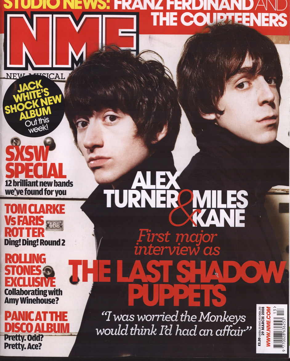
This is the front cover of an existing media product 'NME'. As you can see elements in this I have transferred to my media product. One main reason for this is due to the fact I want to create a realistic media product that uses the convention of music magazines in general as well as 'genre' specific products. In this example the artists are both looking towards the audience, this allows for them to engage with the reader, attracting their attention This is a conventional feature that I have transferred onto my product. The artists also are covering the title and header of the page. This feature is a conventional element I have come across with magazines in general. I felt that this was a strong features to use on my product. The 'main' article has the biggest lures on the page, this allows for the audience's attention to be attracted to a possible 'popular' band, the use of 'large' lures is a feature that i have transferred onto my product. As well as 'large' main lures, lures in general are in a large font allowing for the audience to be captivated by particular articles in the magazine.
Contents page:
This is my final version of my contents page. I have decided to compare it with an existing media product that is of the same genre and that has provided conventional features and elements that I have transferred.
This is the contents page of NME magazine. As you can see the main image in the middle of the contents page has a little mini 'article' that gives a brief overview of what the article has to offer. This feature has been transferred into my contents page. 'contents' listing is positioned down the left of the page, this allows for the more 'important' information to be read first. Contents are labeled in 'bold' headings which allow for the audience to be lured into certain articles. This is a feature that I have transferred across allowing for my product to be closely related to an existing media product. One more feature that i have developed is the use of a 'subscription' box. By looking at a variety of magazines that relate to the music genre AND that don't this feature has stood out as a conventional element.
Double page spread:
This is my final version of my double page spread. I have decided to compare it with an existing media product that is of the same genre and that has provided conventional features and elements that I have transferred.
This is the double page spread of NME magazine. A feature that is similar in this product and my media product is the use of a 'BOLD' main header. This allows for the audience to be easily lured into the article. The NME's double page spread has a 'lure' in the top left corner of the page, this is a feature that I have included on my media product. This allows for the audience to be lured into the article while flicking through the pages. Smaller images relating to the article are placed around the page in boxes, this allows for the articles main story to be backed up by extended 'imagery'. This is a feature that I have included on my media products double page spread. A final conventional aspect that I have come across as a widespread convention throughout magazines in general, is the use of 'text wrap'. This feature is used on the page of the NME which allows for text to seem more vibrant and fit smoothly instead of 'central' placement. This feature I have transferred onto my media product allowing for my product to closely 'mock/ reflect' on a real media product.
This is the final version of my front cover. Compared to the draft versions It has moved on drastically in terms of 'layout' and 'different' but more conventional elements to help convey a realistic media product. The text on the page follows a consistent font style allowing for consistency in 'house style'. The title of the magazine is large allowing for the audience to be attracted more easily. As well as this I decided to have the models head and guitar cover a slight partion of the title. This was a conventional feature that I have transfered. To make sure that I hadn't included pictures that were obtained from the web I changed the corner image to a picture that I have taken interdependently. This feature states that the magazine will have a poster of the band 'Lunar association'. This is another conventional feature that I have transferred from existing products. In the bottom right corner of the page I have included a 'turned' up page. This feature is a convention that I have developed from existing media products, It allows for the audience to get a 'slight' glimpse at the contents of the magazine acting as a lure.
Contents Page:
This is the final version of my contents page. Compared to the draft versions It has moved on drastically in terms of 'layout' and 'different' but more conventional elements to help convey a realistic media product. This was the first and final version of my contents page so no changes have been made to it as personally I felt it portrayed a near resemblance to an existing music magazines contents page. I haven't stated the words 'Contents' in bold letters, or in a large font for a particular reason even though the stating of 'contents' is a typical convention of a contents page. The purpose of stating 'contents' in a smaller text is because i felt that the purpose is conveyed instantly through the use of a 'catchy' pun 'B.E.a.T This week'. The readers eyes will scan from 'B.E.a.T' to 'week' and then the actual content of articles will be instantly cast upon. The feature of using a subscribe box is a conventional element that I have transferred from existing media products. This feature includes a brief article on 'why the audience should subscribe' as well as an overview of the front cover.
Double page spread:
This is the final version of my double page spread. Compared to the draft versions It has moved on drastically in terms of 'layout' and 'different' but more conventional elements to help convey a realistic media product. Changes in the smaller 'boxed' image really help to make it 'stand out' as well as representing the iconic bands name. Such conventional features as 'text wrap' have been applied, this allows for text to flow smoothly and seamlessly on the left page. This feature has been transferred as a typical convention of a magazines 'double page spread' and 'articles'.
This is the first version of my media product. As you can see the lures aren't currently following the house style in terms of 'typography'. This will be a feature that i will edit for the second version. To me the picture of the 'artist' doesn't convey the bands name. To create an iconic look that will reflect the band's name 'Lunar association' I need to edit the photo in photo manipulating software such as 'Photoshop'.
This is the second version of my media product. As you can see the lures have been edited so that they follow the house style. As well as this I have included a pun on the main articles lure for 'Lunar Association'. This will allow for the audience to get a brief idea of what the article is about as well as attracting their attention. The main image has been edited to reflect on the bands name 'Lunar association' ( The use of smoke behind the artist and the artist being cast in shadow allows for an iconic relation to 'Lunar' activity'. This compared to a white backdrop on the previous version allows for the magazine to stand out more.
Contents page:
This is the first and final version of my contents page. The reason I have chosen not to adapt and edit any of the features on the page is because I feel that the page from the result given perfectly or 'near' perfectly represents and conveys the codes and conventions of a music magazines contents page. Features such as the 'mini' review have been transferred from Contents pages such as 'NME' and 'Kerrang'. Such imagery for the band 'Lunar association' allows me to reflect on iconic aspects of the bands name. The model is cast in shadow and yet again smoke is positioned behind the artist forming the shape of a moon.
Double page spread:
This is the first version of the double page spread. In this version the article isn't completely finished but this will be finished by the final version. Looking at the image positioned in the box I feel that it doesn't work well with the background of the main image. In the next version i will edit it to make it blend in with the main image on the page. To me the title follows a consistent house style throughout the magazine and works perfectly.
This is the second version of the double page spread. As you can see I have edited the image in the box to allow for it to blend in and match the background of the main image. I feel that this wasn't an effective choice. In the final version I am going to edit this image to help make the bands iconic feature stand out ( add smoke to reflect on 'Lunar' activity). I feel that the text nearest to the artist on the first page is too centralized. In the final version I will transfer a conventional feature of existing media products, text wrap.
Researching conventional 'band shots' I came across three similar images. These Images i wish to 'recreate' in such a way by transferring the conventional and iconic aspects of them.
Looking at this image of the band 'Band of horses' certain iconic elements can be identified. They are a trio, the lead singer/ artist is the furthest in front. The next 'important' role of the band is behind the singer to the right. The least important artist is behind the lead singer/ artist on the left side, he is hidden slightly in shadow.
I have decided to take my main pictures with a white background as I feel that a dark background like the one in the example to the left makes the artists seem 'hidden' and 'confined' to themselves.
For the double page spread I would like my picture like this or similar. If i choose to use one artist I would like similar 'stances' and 'poses' like the band member in black. Comparing this to the image above an occurring feature is the fact that the band are all looking at towards the reader. This allows for the audience to feel engaged with the subject in hand i.e. The band.
Yet again the status/ role of each members importance is conveyed through the positioning of them. The lead singer is in front. The drummer in black is the next 'dominiant' role and is to the left of the singer and the bassist is behind the singer to the right.
comparing this image to the other two images a difference can be seen in the location - the fact that it is an exterior location. But the mise en scene reflects on the 'indie' genre. The sky is blue creating a calm and tranquil environment, reflective of indie music. Trees state that the band are in the countryside, which is backed up by the use of a 'stone staircase'. Also the bands costume is reflective of 19th century clothing, this to me reflects on the artists style of music
Another iconic feature that has occurred from other research is the fact the band are holding instruments. This allows for the style of music to be conveyed through the use of imagery as well as the image saying 'instruments' are a dominant feature in the bands music.
An example of the bands music is provided below:
As you can tell from the style of music the artists costume in the image above is appropriate and conveys a perfect mise en scene.
Models Overlap the title, but the title of the magazine is till readable as it is 'iconic' (font styles iconic to the magazine)
Torn edges of the background behind the word 'Download' creates an 'urban' feel. This reflects on the genre of the magazine.
A yellow stroke is used on the word 'Download' which makes it stand out and makes it more noticeable to the audience, it also reflects on a possible main feature/ theme that is congruent throughout the magazine.
The colour scheme reflects on the genre of the magazine (hip hop). This colour is a feature that is congruent throughout the magazine i.e. it will follow a consistent house style.
The contents are tilted. This is a technique that is used possibly to reflect on the genre. Hip hop targets an audience that are 'edgy' and 'cool'. This technique to me reflects on this.
There is a cartoon effect on the model. This is to help reflect on the target audience and reflects on the genre of magazine.
Use of 'urban' convention, transferred in the title of the page 'conteXt'.
'WORLD EXCLUSIVE' is positioned in the top left corner of the page. This is to help attract the attention of the audience when flicking through the pages.
There is the use of a large font size in the title to help attract attention.
Colour scheme and font style used reflects on the genre of the magazine.
Black and white pictures - reflects on the rock genre (vintage/ reminiscent)
An information bar is positioned down the right side of the page - this is clearly untied from the main 'writing' on the page and is a typical conventional feature.
Iconic imagery that reflects the magazines genre and sub genre i.e. music magazine with a sub genre of 'Indie rock'.
Gaze Theory:
For an indie rock genre magazine conventional imagery that is used is of 'bands' or the 'artist'. This is a band shot of 'Muse'. As you can see their fashion sense is 'indie' which will appeal to the target audience. Hair of all the band members is long and smart but 'trendy' clothing is worn. Two of the members also have slight facial hair which reflects on an 'urban' and 'cool' look.
Girls will aspire to 'get' men like this, whereas boys aspire to look like the men (attractive and well presentable/ trendy).
After evaluating the school magazine I am now able to channel the negative problems in the task such as time management etc. and use these 'pointers' to my advantage to help me create a stronger magazine.
The main part of the task I have to create the front page, contents page and double page spread of a music magazine. This involves me having to research typical conventions in 'target audience of the genre', 'typical conventions of current existing products' and 'Imagery' (Using gaze theory).
Following this research I am going to have to create sketch drafts to help provide an idea on such features as 'layout; to help me cut down attributes for my final ideas.
This is the final version of the front cover of my school magazine. As you can see I have used a location and model that reflects on the issues theme (winter). The reason for choosing this features is due to the fact it conventionally reflects the conventions of real media products. Another feature that reflects on the theme is the 'house style' in terms of colours used. The red reflects on 'christmas' a festive holiday during the winter season and white reflecting on snow, an iconic feature of winter.
Lures stand out to help attract the attention of the audience. This element is conventional of magazines in general. As well as the conventional lure a 'brief' contents lure is provided in the bottom left corner of the front cover. This feature is conventional of a school magazine hence the reason for the transfer of this element.
This is the final version of the contents page of my school magazine. As you can see I have kept a consistent house style throughout the magazine. This aspect is conventional of magazines in general. Down the left of the page the contents are aligned. Each article is clearly labelled with a number and title, these features are in a large font to help make them stand out. I have used two images that advertise certain 'articles'. These are conventional aspects from magazines in general that I have chosen to transfer into this product. The articles act as lures and help the articles to stand out.
Conventional of a school magazine is the use of a school 'logo'. This is a feature that i have used in this product as shown to the left. A final conventional feature that I have chosen is the use of 'editors notes'. This is a feature i have come across in various magazines, so I felt that including this conventional aspect would help to make the product close in comparison to a real media product.
A feature that i wish I could change would be not using columns to layout the contents page. This would help the page to conventionally reflect on real media products.
After drawing up the drafts for the front page and contents page of the magazine i got a feel for how I was going to lay out the magazine. From here i started the designs of the front page and contents. Following a consistent house style and layout here are 3 versions of the magazine that i have created: