
This is my final version of my front cover. I have decided to compare it with an existing media product that is of the same genre and that has provided conventional features and elements that I have transferred.
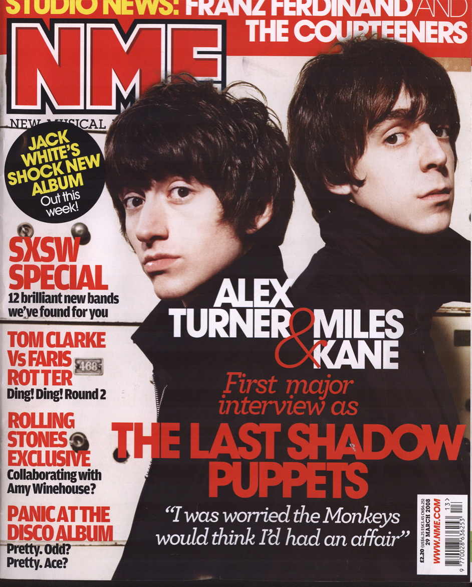
This is the front cover of an existing media product 'NME'. As you can see elements in this I have transferred to my media product. One main reason for this is due to the fact I want to create a realistic media product that uses the convention of music magazines in general as well as 'genre' specific products. In this example the artists are both looking towards the audience, this allows for them to engage with the reader, attracting their attention This is a conventional feature that I have transferred onto my product. The artists also are covering the title and header of the page. This feature is a conventional element I have come across with magazines in general. I felt that this was a strong features to use on my product. The 'main' article has the biggest lures on the page, this allows for the audience's attention to be attracted to a possible 'popular' band, the use of 'large' lures is a feature that i have transferred onto my product. As well as 'large' main lures, lures in general are in a large font allowing for the audience to be captivated by particular articles in the magazine.
Contents page:

This is my final version of my contents page. I have decided to compare it with an existing media product that is of the same genre and that has provided conventional features and elements that I have transferred.

This is the contents page of NME magazine. As you can see the main image in the middle of the contents page has a little mini 'article' that gives a brief overview of what the article has to offer. This feature has been transferred into my contents page. 'contents' listing is positioned down the left of the page, this allows for the more 'important' information to be read first. Contents are labeled in 'bold' headings which allow for the audience to be lured into certain articles. This is a feature that I have transferred across allowing for my product to be closely related to an existing media product. One more feature that i have developed is the use of a 'subscription' box. By looking at a variety of magazines that relate to the music genre AND that don't this feature has stood out as a conventional element.
Double page spread:

This is my final version of my double page spread. I have decided to compare it with an existing media product that is of the same genre and that has provided conventional features and elements that I have transferred.

This is the double page spread of NME magazine. A feature that is similar in this product and my media product is the use of a 'BOLD' main header. This allows for the audience to be easily lured into the article. The NME's double page spread has a 'lure' in the top left corner of the page, this is a feature that I have included on my media product. This allows for the audience to be lured into the article while flicking through the pages. Smaller images relating to the article are placed around the page in boxes, this allows for the articles main story to be backed up by extended 'imagery'. This is a feature that I have included on my media products double page spread. A final conventional aspect that I have come across as a widespread convention throughout magazines in general, is the use of 'text wrap'. This feature is used on the page of the NME which allows for text to seem more vibrant and fit smoothly instead of 'central' placement. This feature I have transferred onto my media product allowing for my product to closely 'mock/ reflect' on a real media product.
No comments:
Post a Comment